Typography, colour, UI elements and motion. Everything here uses the site's real classes, so this page cannot drift from what the site renders. Click any class name to copy it.
Typography
Colours
UI elements
Animations
Fluid scale — every size interpolates between a 380px and a 1140px viewport, then clamps. Letter-spacing is in em so tracking follows the size automatically. Body stays fixed at 16px for readability. Click any class name to copy it.
title1
62→36 · lh 68→42 · −0.0323em · 500
המדרסים האורטופדיים הטובים בישראל
title2
48→30 · lh 58→38 · −0.025em · 400
המדרסים האורטופדיים הטובים בישראל
display2
58→32 · lh 68→40 · −0.0431em · 400
המדרסים האורטופדיים הטובים בישראל
title3
32→24 · lh 40→32 · −0.0156em · 600
המדרסים האורטופדיים הטובים בישראל
title4
26→20 · lh 34→28 · −0.0385em · 600
המדרסים האורטופדיים הטובים בישראל
title5
22→18 · lh 30→26 · −0.0182em · 600
המדרסים האורטופדיים הטובים בישראל
body-large
18→16 · lh 26→24 · −0.0167em · 400
המדרסים האורטופדיים הטובים בישראל
body-large-medium
18→16 · lh 26→24 · −0.0167em · 500
המדרסים האורטופדיים הטובים בישראל
body
16 fixed · lh 26 · −0.01em · 400
המדרסים האורטופדיים הטובים בישראל
body-medium
16 fixed · lh 26 · −0.01em · 500
המדרסים האורטופדיים הטובים בישראל
body-bold
16 fixed · lh 26 · −0.01em · 700
המדרסים האורטופדיים הטובים בישראל
Blues drive everything interactive; greys carry surfaces and text. Link and accent are the same Blue 600.
BLUE ZION
#000B1E
Blue 950
#011942
Blue 900
#013184
Blue 800
#024AC5
Blue 700
#0963FD
Blue 600
#307BFD
Blue 500
#5D98FE
Blue 400
#86B2FE
Blue 300
#AECCFE
Blue 200
#D7E5FF
Blue 100
#EBF2FF
Blue 50
GREY
#FBFCFE
Grey 1
#F4F7FA
Grey 2
#DEE4ED
Grey 3
#48556B
Grey 4
#2D3B53
Grey 5
#172235
Grey 6
SEMANTIC
#071F54
Title on white
#39393B
Text on white
#767676
Text muted
#0963FD
Link / accent
#F3F3F3
Page bg
#D92D20
Error
Text colour classes
txt_col__Blue-600
#0963fd
טקסט לדוגמה
txt_col__Blue-900
#011942
טקסט לדוגמה
txt_col__grey-1
#fbfcfe
טקסט לדוגמה
txt_col__grey-4
#48556b
טקסט לדוגמה
txt_col__grey-6
#172235
טקסט לדוגמה
Radius, spacing, elevation, form controls and components.
Border radius
From _variables.scss. Applied through Elementor's radius control or the SCSS token.
$radius-sm
8px
$radius-md
12px
$radius-lg
20px
$radius-pill
9999px
Spacing scale
The same rhythm used for gaps and padding across the site.
$gap-xs
0.5rem
$gap-sm
1rem
$gap-md
1.5rem
$gap-lg
2rem
$gap-xl
3rem
$gap-2xl
4rem
$gap-3xl
5rem
Elevation
Navy-tinted, two layers per step. Add nf-shadow--hover to raise one level on hover.
nf-shadow-sm
Resting surface — inputs, chips
nf-shadow-md
Default card at rest
nf-shadow-lg
Raised — card hover, active tab
nf-shadow-xl
Lifted — modal, popover
Image wash
A 24% #1b43be tint with the 20px card radius. Apply it to the CONTAINER holding the image — the tint is an overlay, so one class works for any image without hardcoding its URL, and it works whether the image is a CSS background or an child. Put it on a bare and you get the radius only, since replaced elements cannot render an overlay.
nf-img-wash
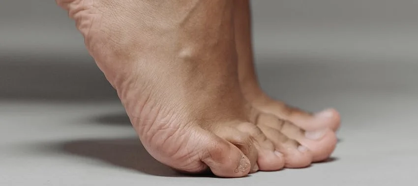
without
with nf-img-wash
Form controls
Native Elementor atomic form widgets styled through assignable classes, so validation and keyboard behaviour stay intact. All single-line controls are 54px.
nf-field
nf-field--inset
nf-label
nf-input
nf-input--error
nf-choice
nf-help-text
nf-error-text
Text
Telephone
Number
Password
URL
Required
Read-only
Error
כתובת האימייל אינה תקינה
Select
Textarea
Date
Time
File
Inset label
שם מלא
דואר אלקטרוני
Checkbox & radio
אני מאשר/ת קבלת דיוור
קראתי את התקנון
בוקר
צהריים
ערב
Submit button
Accordion (JetEngine)
JetTabs accordion driven by a repeater. Plus/minus icons are drawn from the client icon set and swap on the active-toggle state.
elements_accordion_dynamic
nf-faq
GSAP + ScrollTrigger, driven entirely by classes. Add one to any element in Advanced → CSS Classes. Live demos of every effect are on the Animation reference page.
an-title__main1
Headline lifts and fades in
an-title__main2
Headline wipes up from behind its baseline
an-text__fade1
Body copy fades up, shorter travel
an-media__reveal1
Image scales down into place from 1.06
an-media__float1
Slow parallax drift while scrolling past
an-btn__pop1
Button fades up with a slight overshoot
an-count__up1
Counts 0 → the number already in the markup
an-stagger__fade1
Group wrapper — children rise and fade in
an-stagger__scale1
Group wrapper — children fade in from 0.94
an-stagger__slide1
Group wrapper — children slide from the start edge
an-stagger__rise1
Group wrapper — scroll-linked, 0.6→1 scale, 0.3→1 opacity
an-stagger__item
Marks each child that participates in a group
Fine-tuning attributes
Added in Advanced → Attributes on the same element as the animation class.
data-an-delay
Extra wait before starting, seconds
data-an-duration
Override duration, seconds
data-an-stagger
Gap between children (default 0.1s)
data-an-start
ScrollTrigger start, e.g. top 90%
data-an-once
false replays on every scroll-in
data-an-scale-from
an-stagger__rise1 starting scale
data-an-opacity-from
an-stagger__rise1 starting opacity
data-an-y
an-stagger__rise1 starting offset, px
data-an-scrub
Seconds of catch-up smoothing
פסקת פתיחה שמדגימה את רוחב הקריאה. הטקסט נעצר ב־70 תווים בערך, כך שהעין חוזרת בקלות לתחילת השורה הבאה. אפשר לשלב קישור בתוך הטקסט, הדגשה וגם הטיה מבלי לשבור את המקצב.
הכותרות מקבלות מרווח גדול יותר מעליהן מאשר מתחתיהן. זה מה שמקבץ כותרת יחד עם הטקסט שהיא פותחת, במקום להשאיר אותה תלויה בין שתי פסקאות.

מתחת לתמונה אפשר לראות שהטקסט צר מהתמונה. זה ההבדל בין המכל, שהוא מלא, לבין אלמנטי הטקסט, שמוגבלים למידה קבועה וממורכזים בתוכו.
ציטוט מודגש שרץ לרוחב הקריאה, עם קו בצבע המותג בקצה הקריאה.
ד״ר ישראל ישראלי, אורתופד
| דגם | מיועד ל | תמיכה | אחריות |
|---|---|---|---|
| Care+ | שימוש יומיומי | בינונית | שנתיים |
| Hardcore | ספורט עצים | גבוהה | שנתיים |
| Boost | ריצה | גבוהה | שנתיים |
| Elegant | נעליים אלגנטיות | נמוכה | שנתיים |

מעל — figure ללא כיתוב. מתחת — תמונה בודדת, בלי figure כלל. שתיהן מקבלות את אותו רוחב מלא ואת אותו מרווח אנכי.

פסקה אחרונה אחרי קו מפריד, לסגירת המקצב.
אנחנו כאן עבורך! השאירו פרטים ונציגנו יחזרו אליכם בהקדם האפשרי
לקוחות יקרים,
לרגל חג הסוכות, חברת ניו-פיט יוצאת לחופשה. נשוב לפעילות בצאת החג ב-4.10. בברכת חג שמח לכל בית ישראל
צוות ניו-פיט
תפריט נגישות
התאמות אישיות לפי תקן ת״י 5568בחרו פרופיל מותאם מראש להפעלת מקבץ הגדרות נגישות בלחיצה אחת:
יישור טקסט
גופנים והגדלה
ערכות צבעים וניגודיות
הדגשות צבע בתוכן
כלי עזר לקריאה ומיקוד